
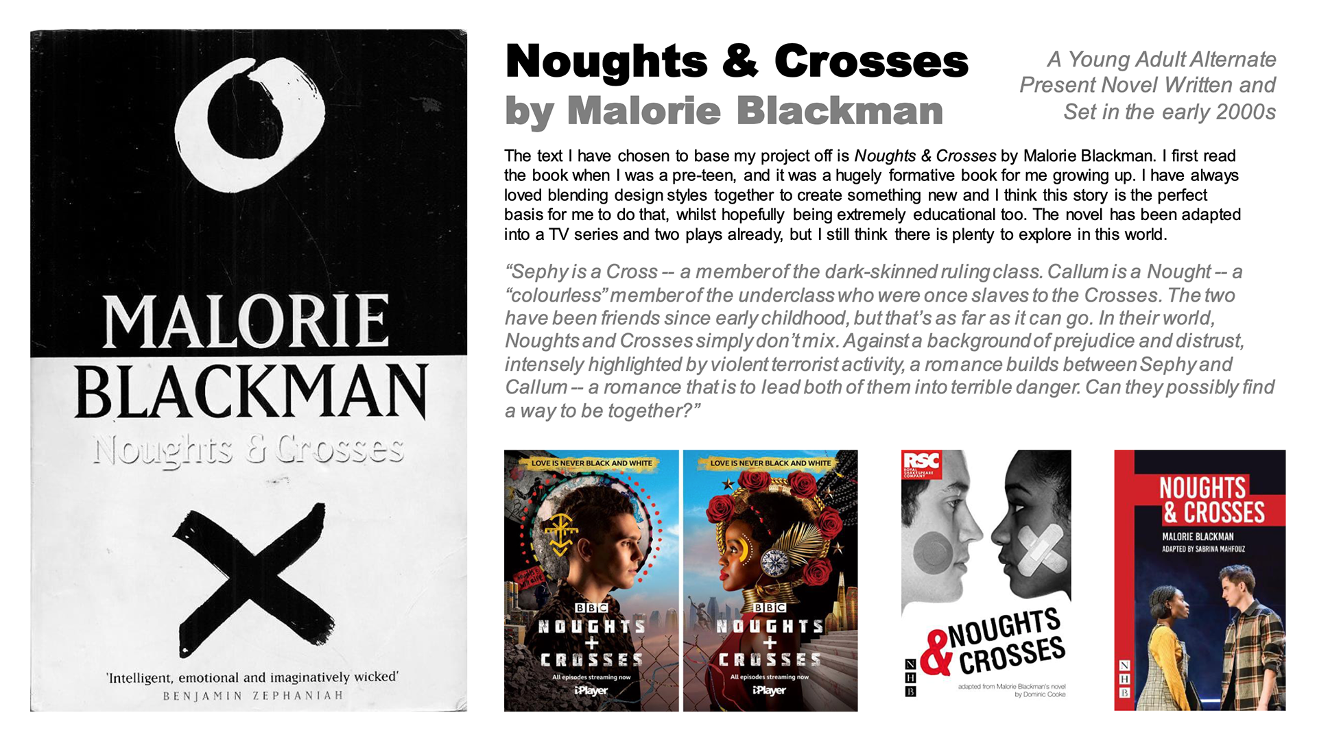
This page outlines my final project as part of my Undergraduate course. For this project, I adapted Malorie Blackman's 2001 novel 'Noughts & Crosses'. I designed a Set, various Graphic Props and Set Pieces, as well as a Motion Poster.
--------------------- SET DESIGN ---------------------
RESEARCH
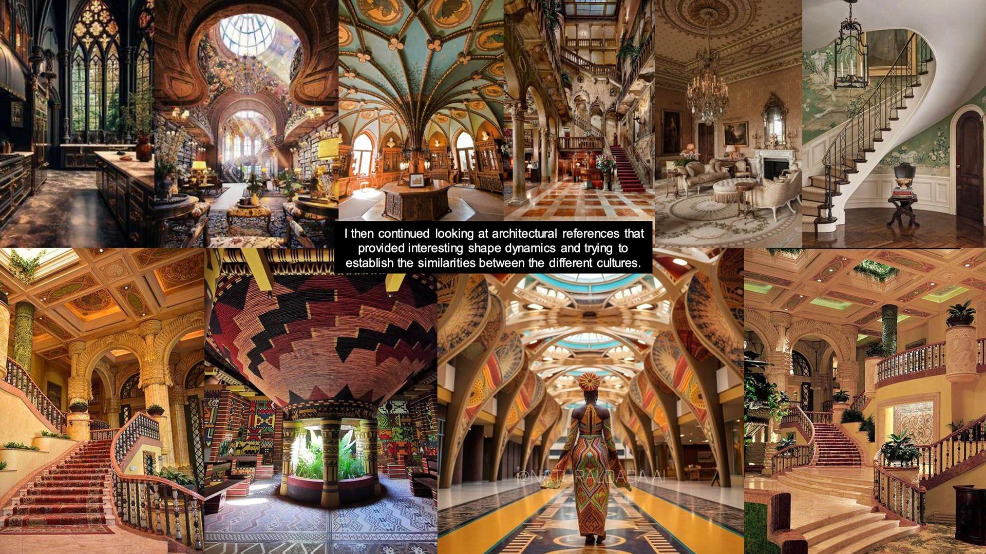
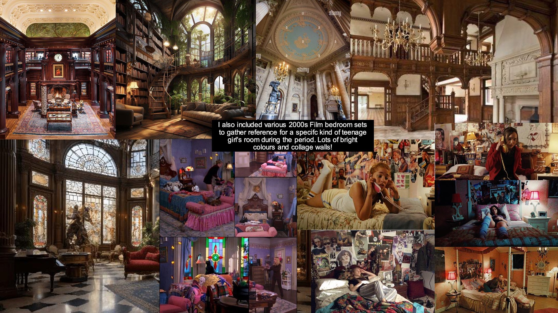
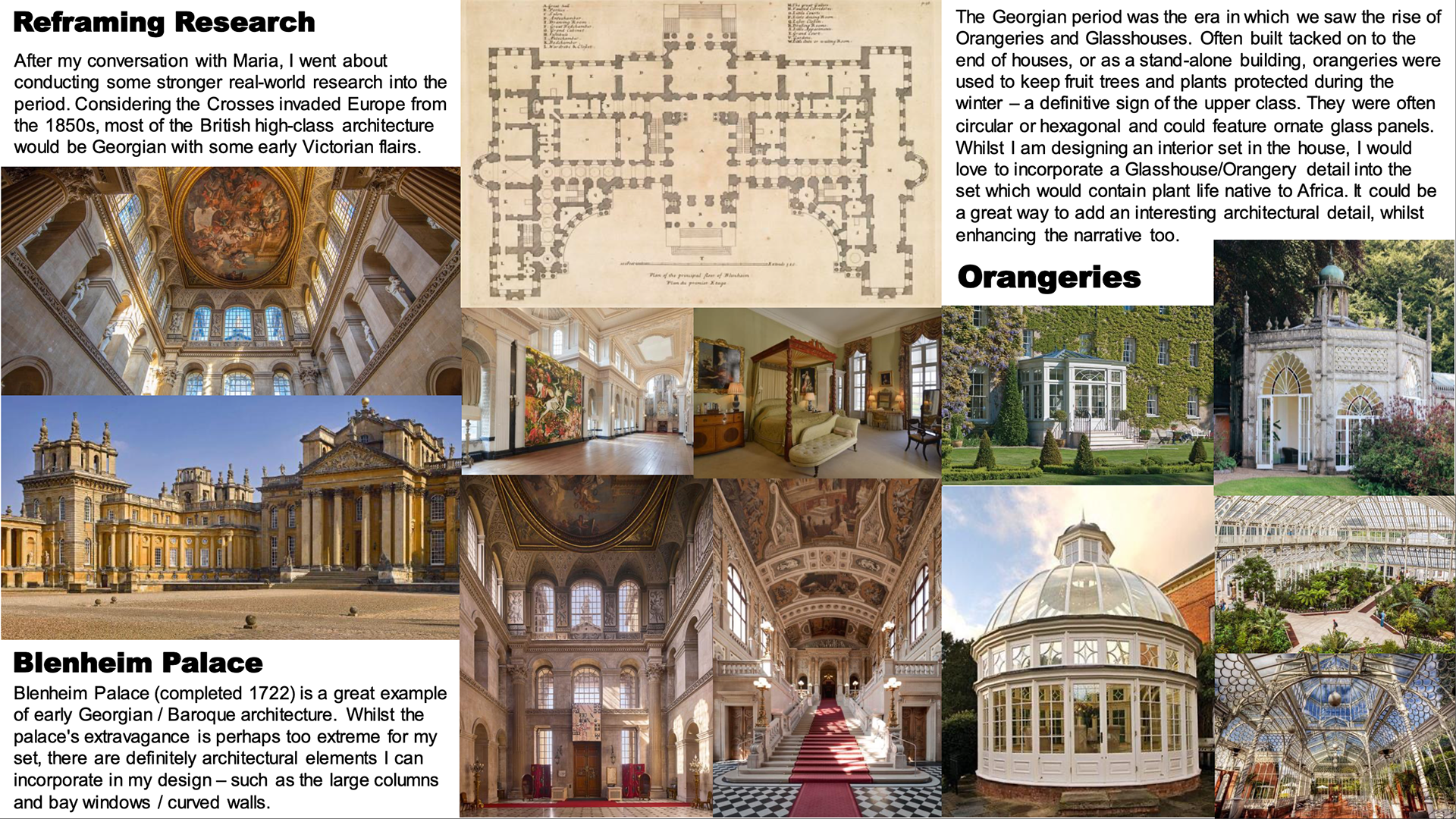
To start off the project, I needed to gather both architectural and thematic reference for this world. I looked at British Stately homes and West African vernacular architecture. As well as researching into a 2000s teenage girl's bedroom


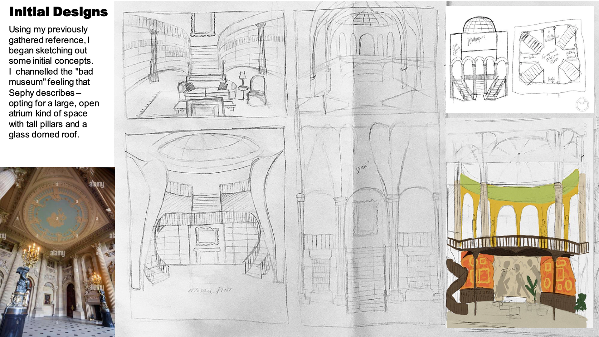
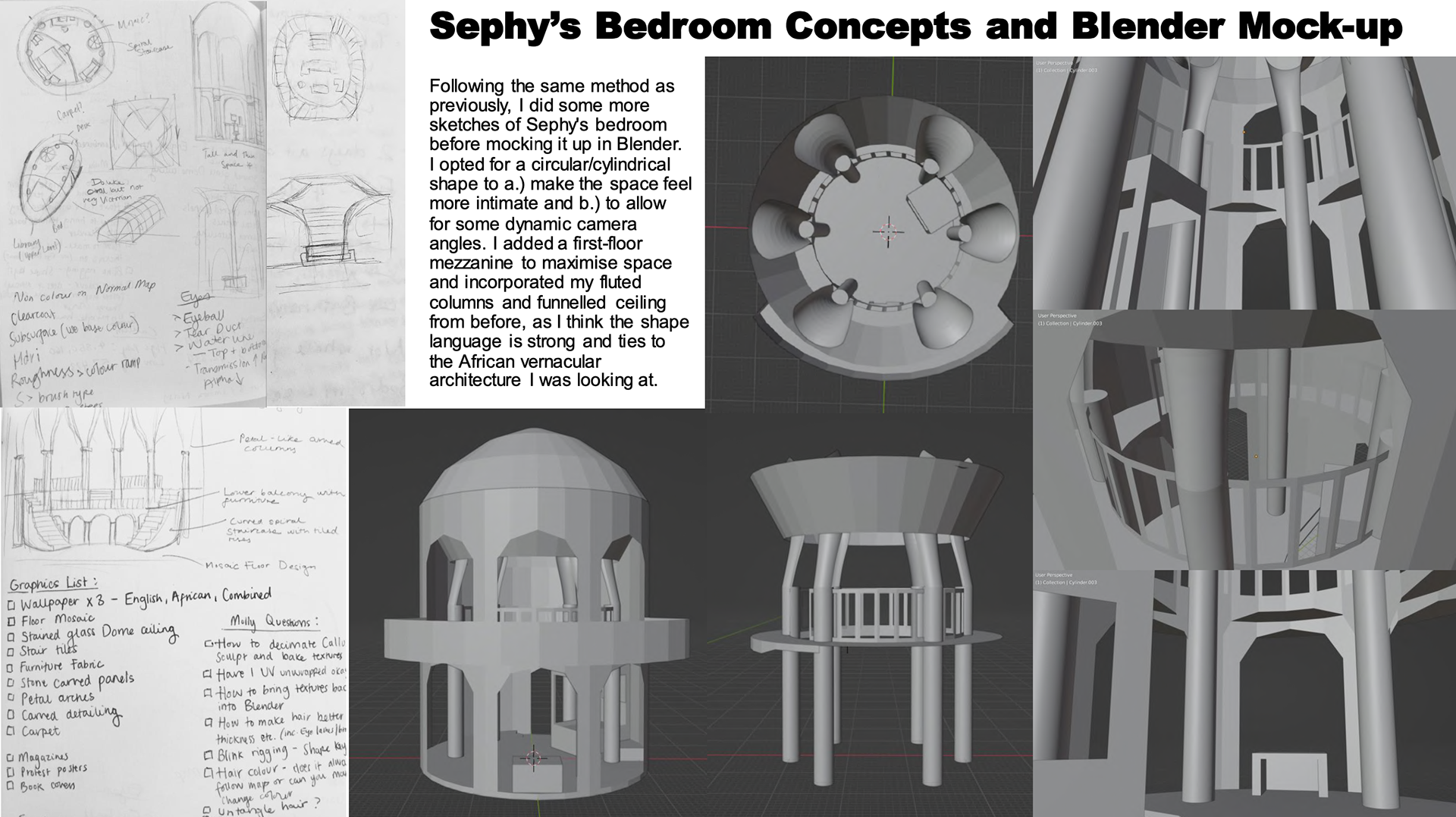
DESIGNING SEPHY's Bedroom
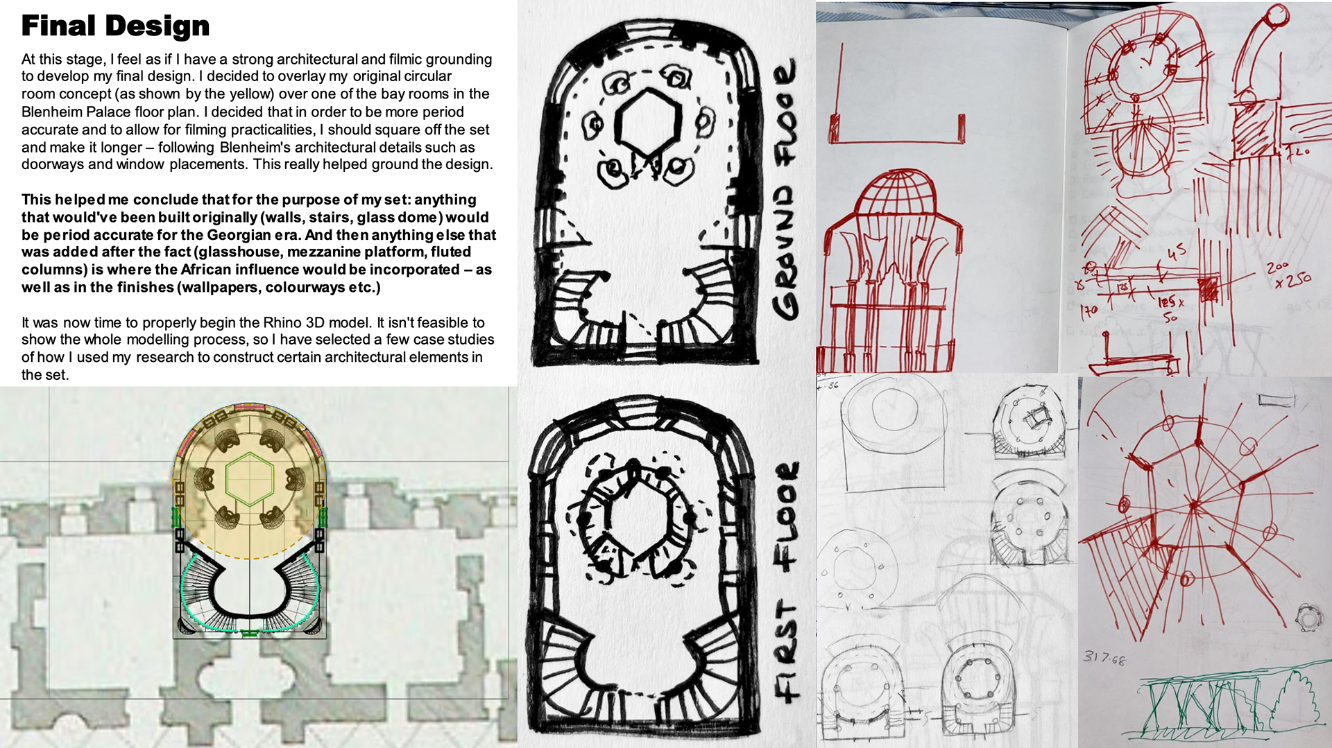
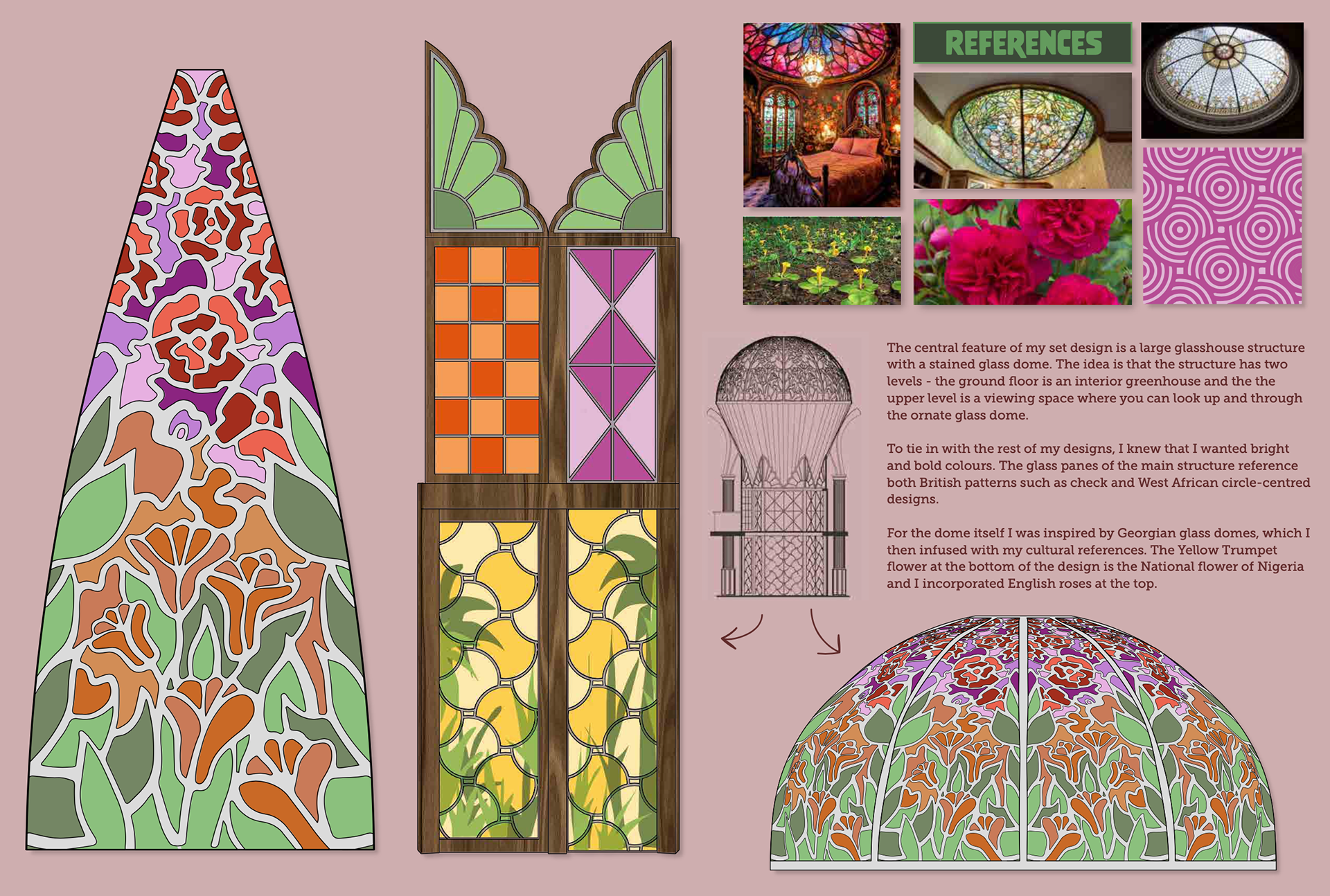
Taking inspiration from my references, I sketched out some initial ideas. I knew I wanted a multi level set and after researching Blenheim Palace and Georgian Orangeries, I found an interesting way to blend these different cultural concepts together.
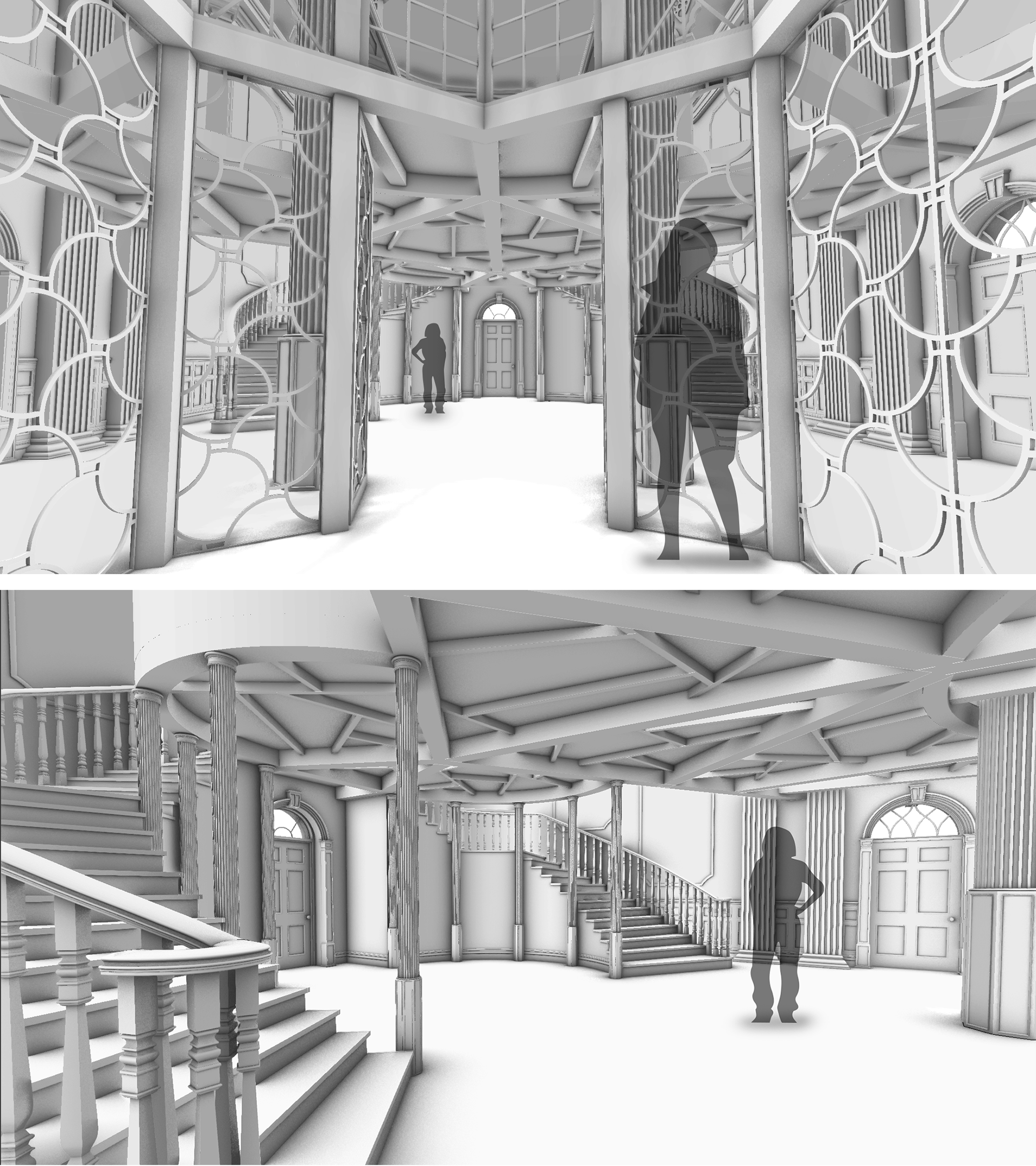
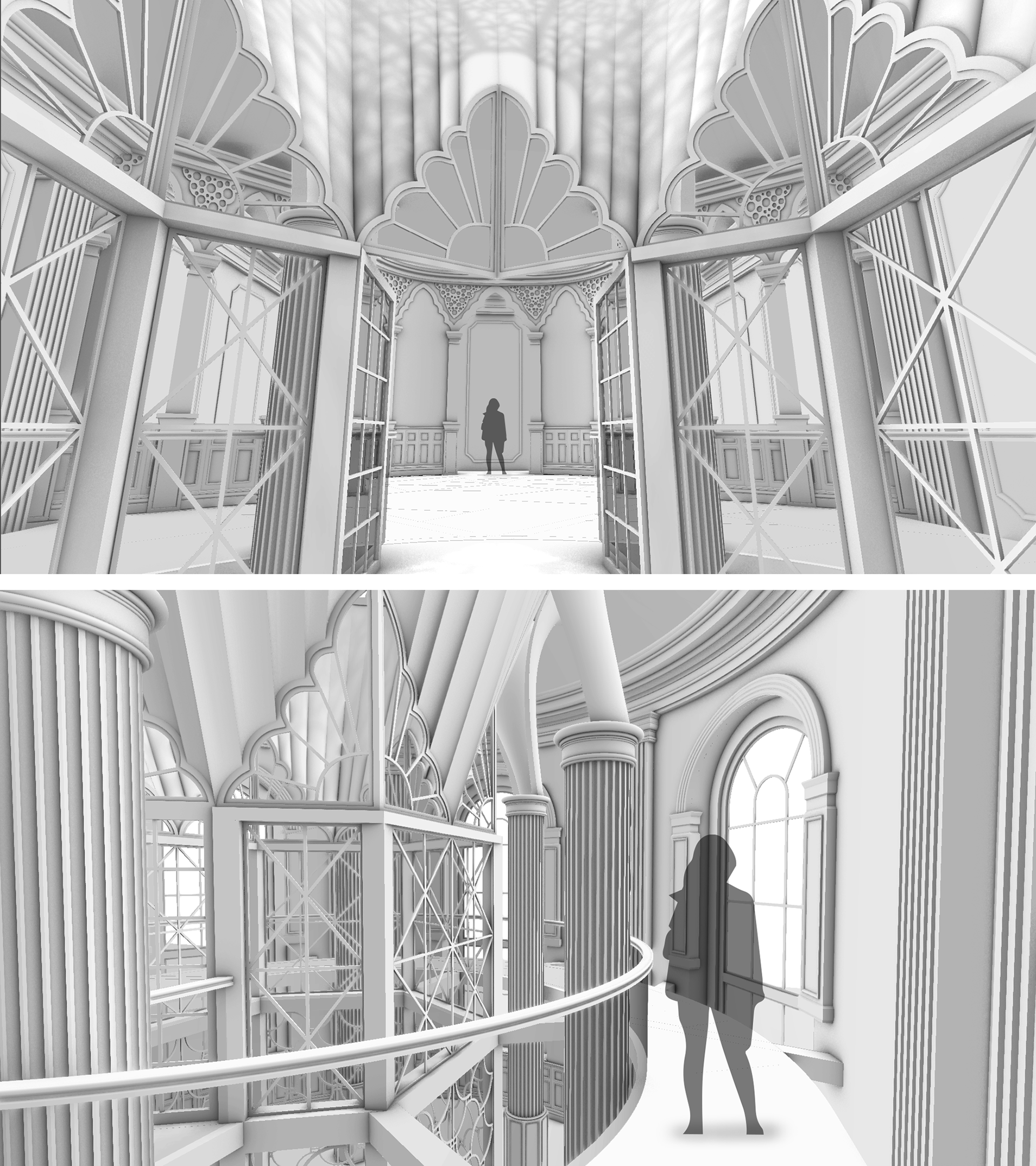
RHINO MODEL
I then modelled the set in Rhino 3D. I love the fusion of the cultures and the grandness of the design for a teenage girl's bedroom. Who doesn't want a greenhouse/orangery in the centre of their room!


DRAWING
This first drawing is a general assembly sheet. In reality, this set would be split into many drawings, and as I only had a limited amount of time - I drew an overly simple P&E layout to give an overall sense of the set.

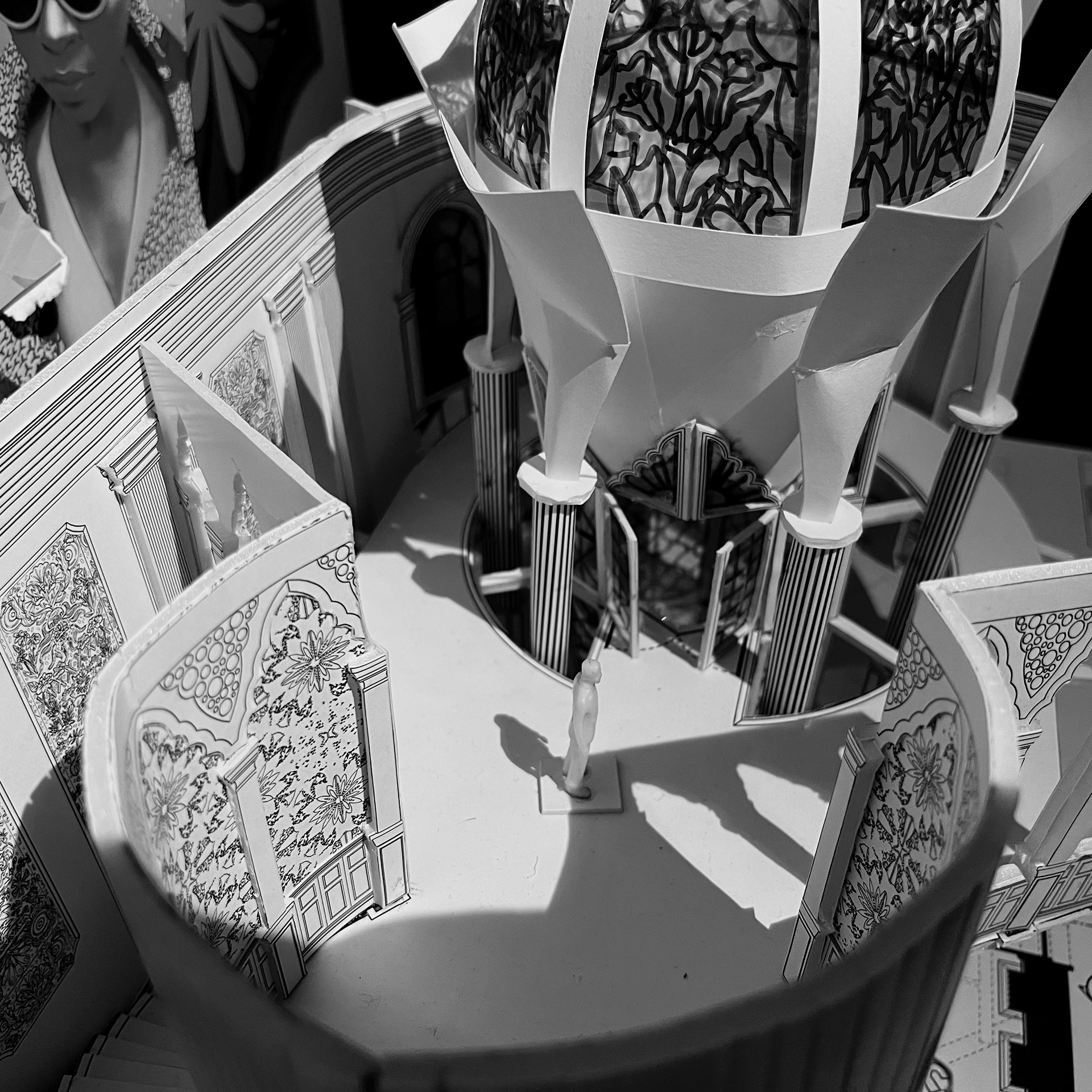
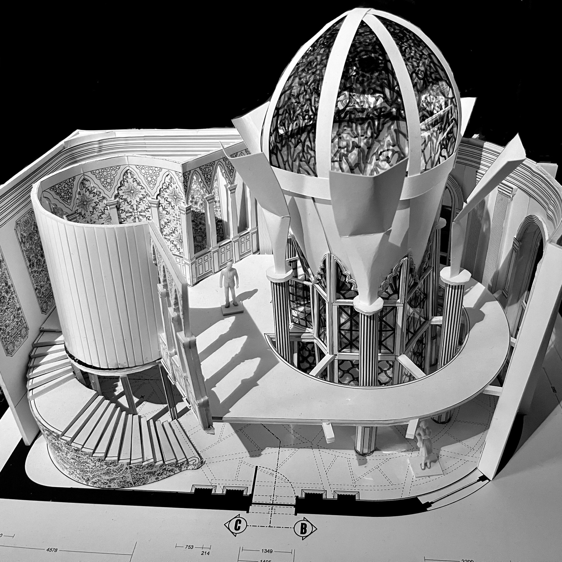
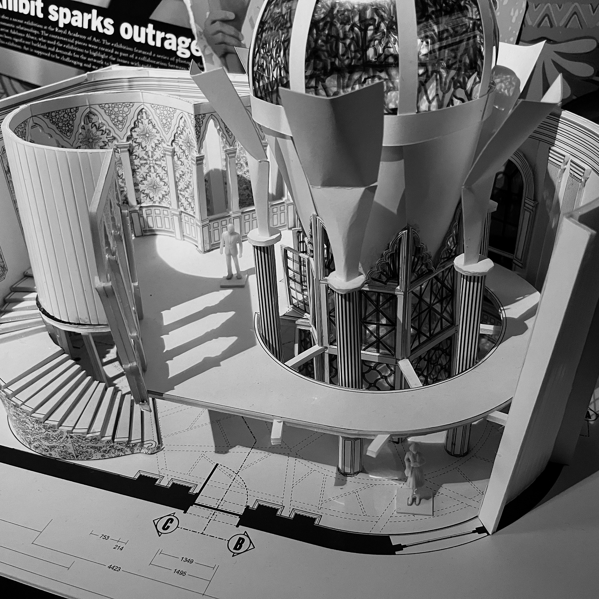
WHITE CARD MODEL
A scale model of Sephy's Bedroom.


--------------------- GRAPHICS ---------------------
RESEARCH
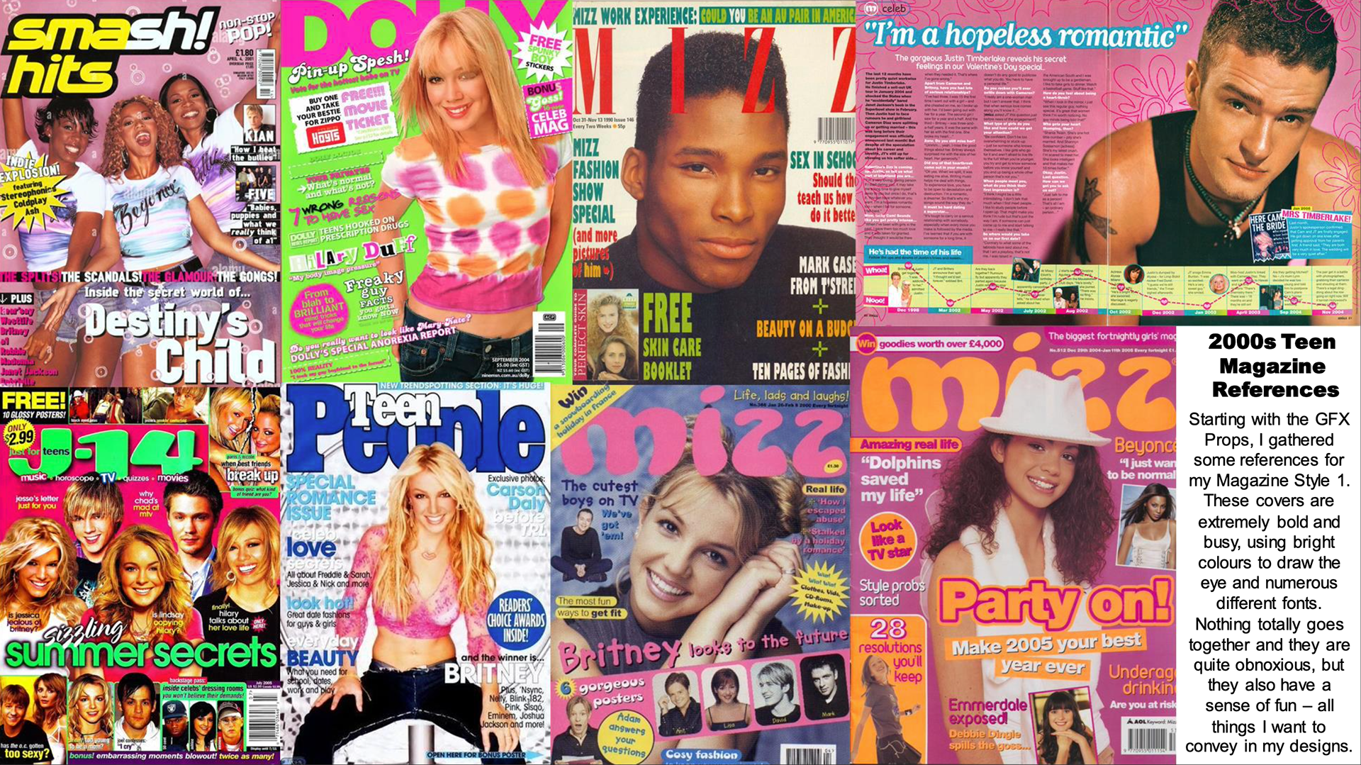
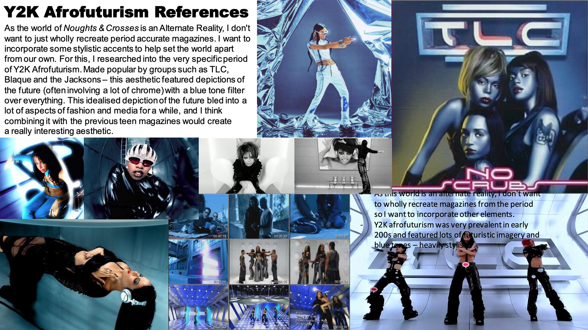
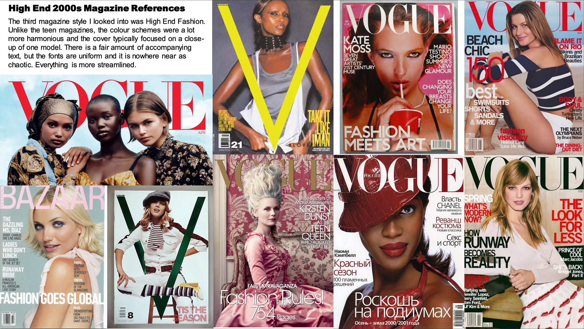
For the Graphics part of the project, I wanted to design some Graphic Props and Set Pieces to populate Sephy's Bedroom. I wanted to create some magazines/newspapers, so I did some research into slightly trashy 2000s magazines and tabloid newspapers, as well as Y2K Afrofuturism to help create a more distinct visual style for this world.

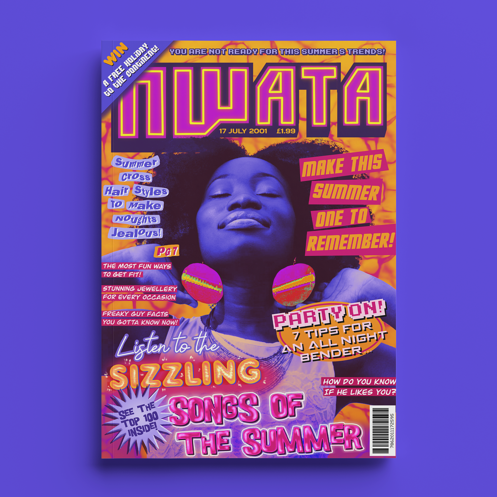
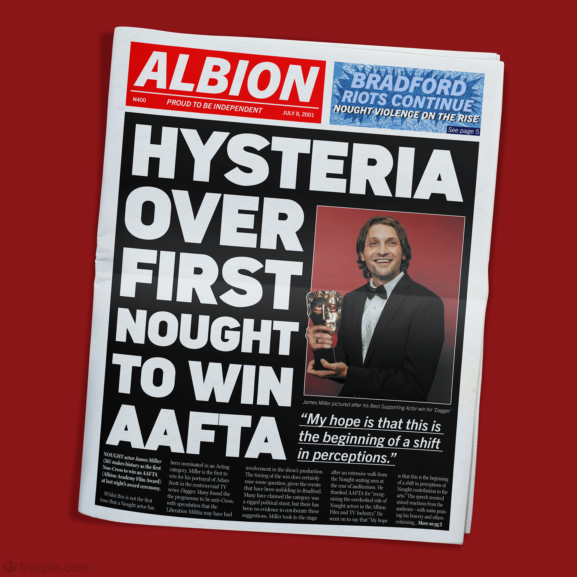
MAGAZINES / NewsPaper
I created three magazine brands, each taking reference from a different facet of late 90s/Early 00s media styles. I also created a tabloid newspaper. I love the boldness of these designs and the eye-catching colour combinations.


WALLPAPER RESEARCH
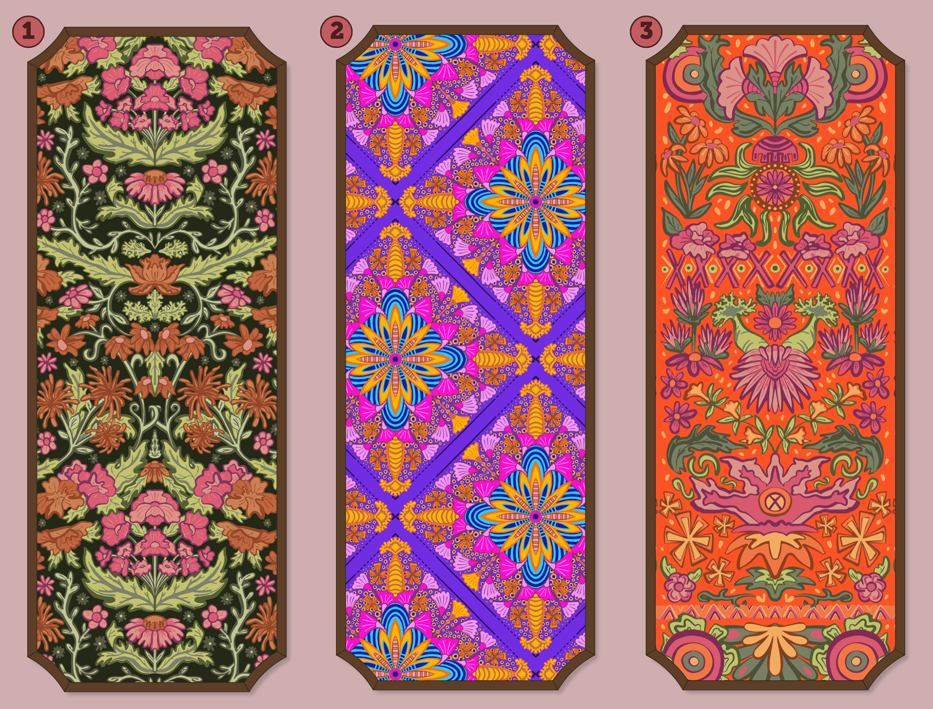
As part of the Scenic Graphics I wanted to design, I planned on creating three wallpaper designs. One inspired by British printing, one by African Ankara prints and one that combined the two cultures together.

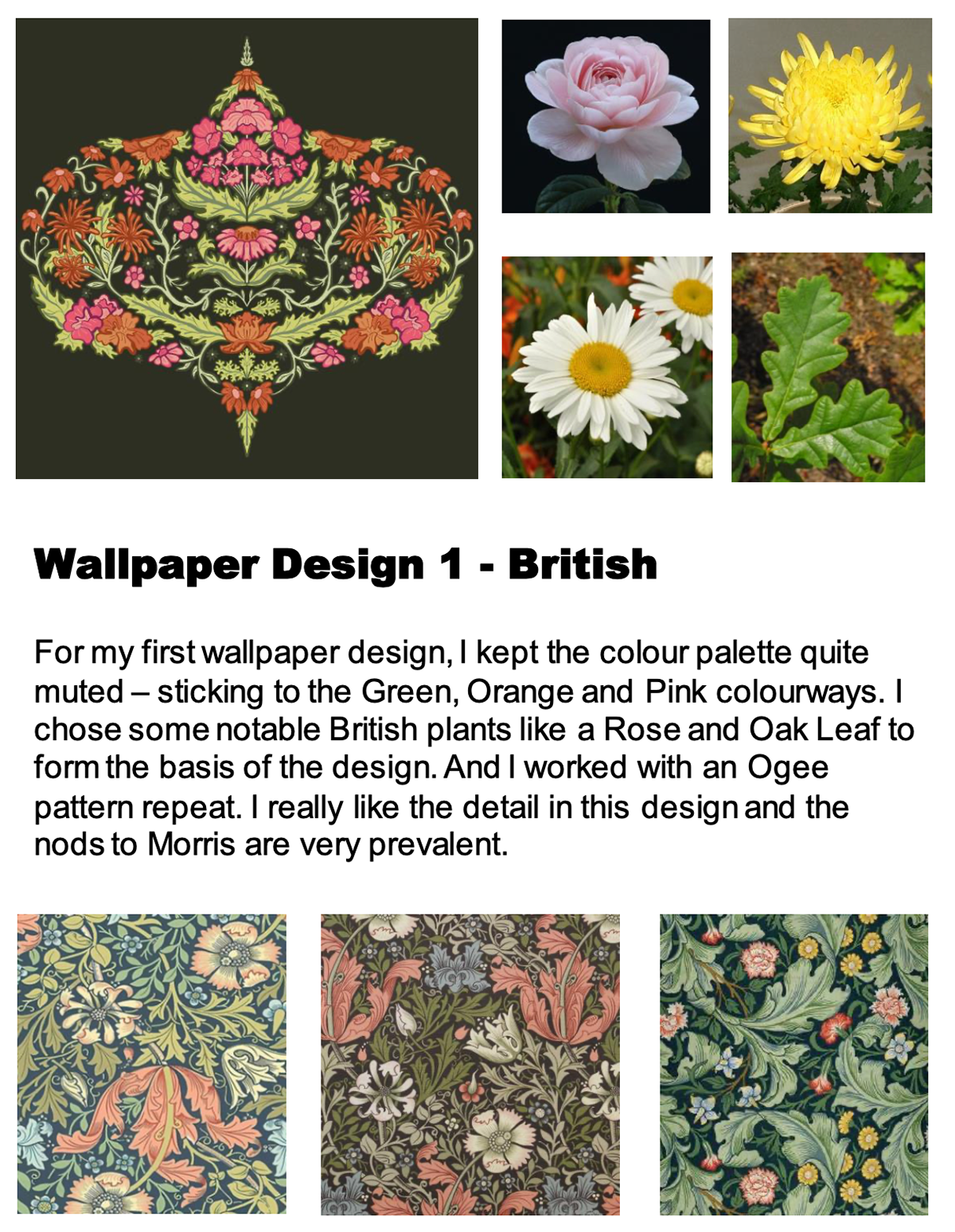
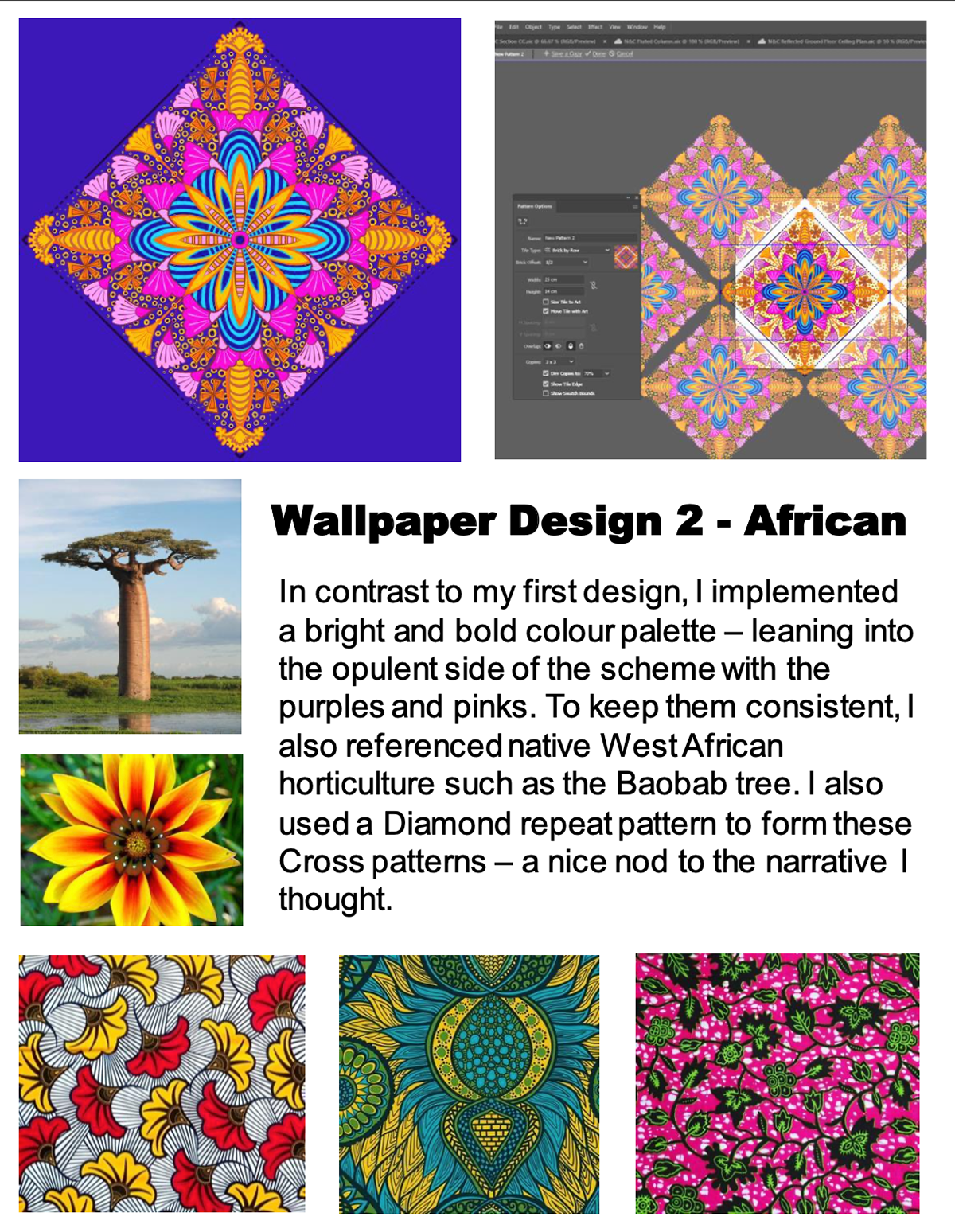
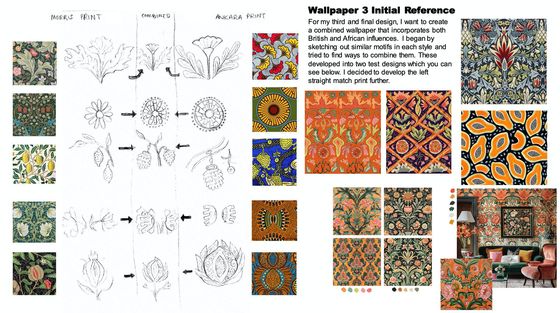
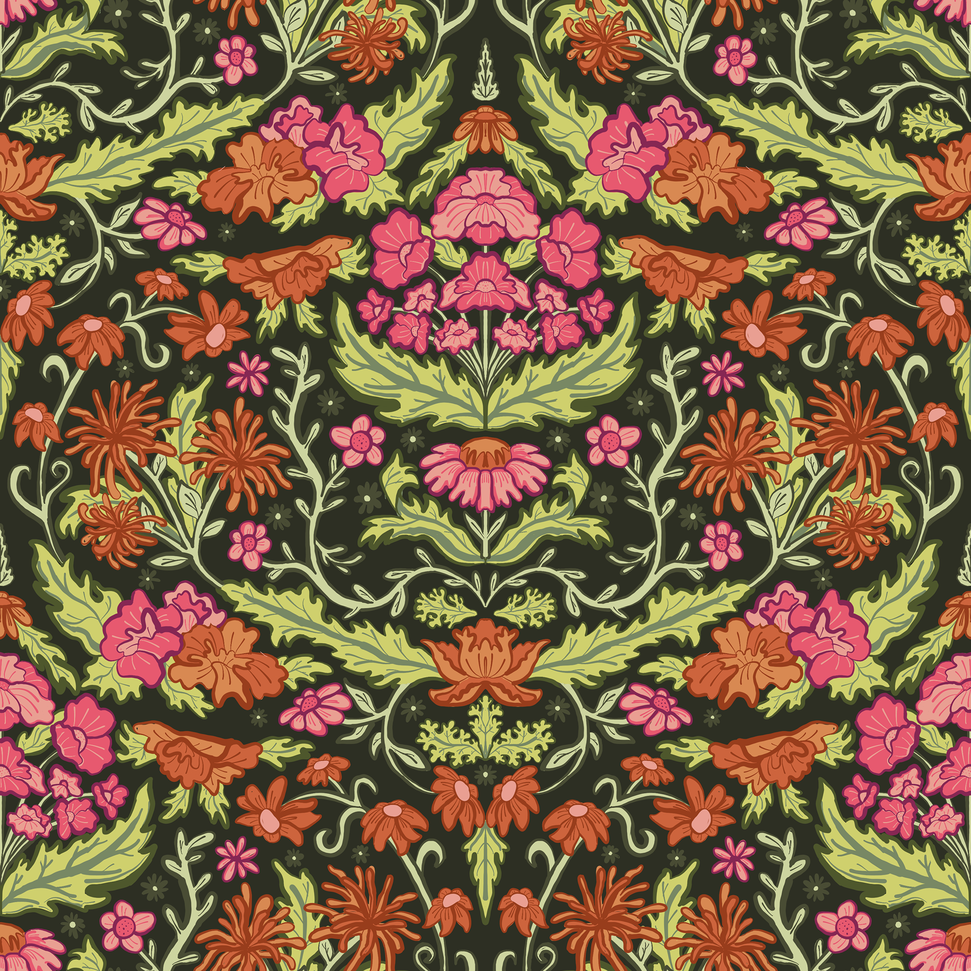
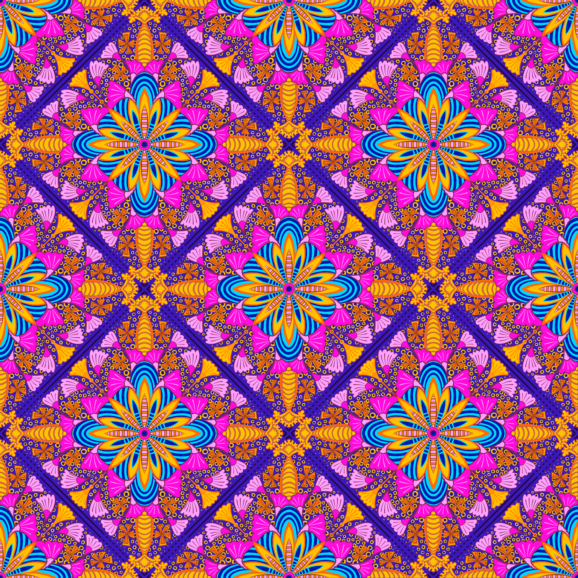
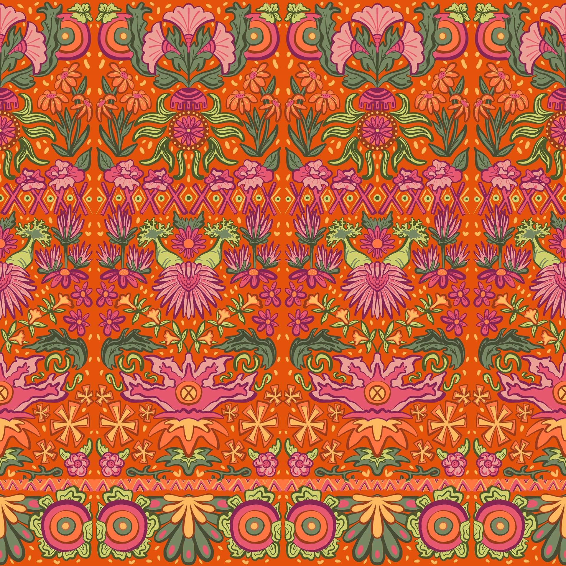
WALLPAPER DESIGNS
The three wallpaper designs I created. I especially like the orange, combined culture design. I will be using these later as part of the set and my motion poster.
SCENIC GRAPHICS
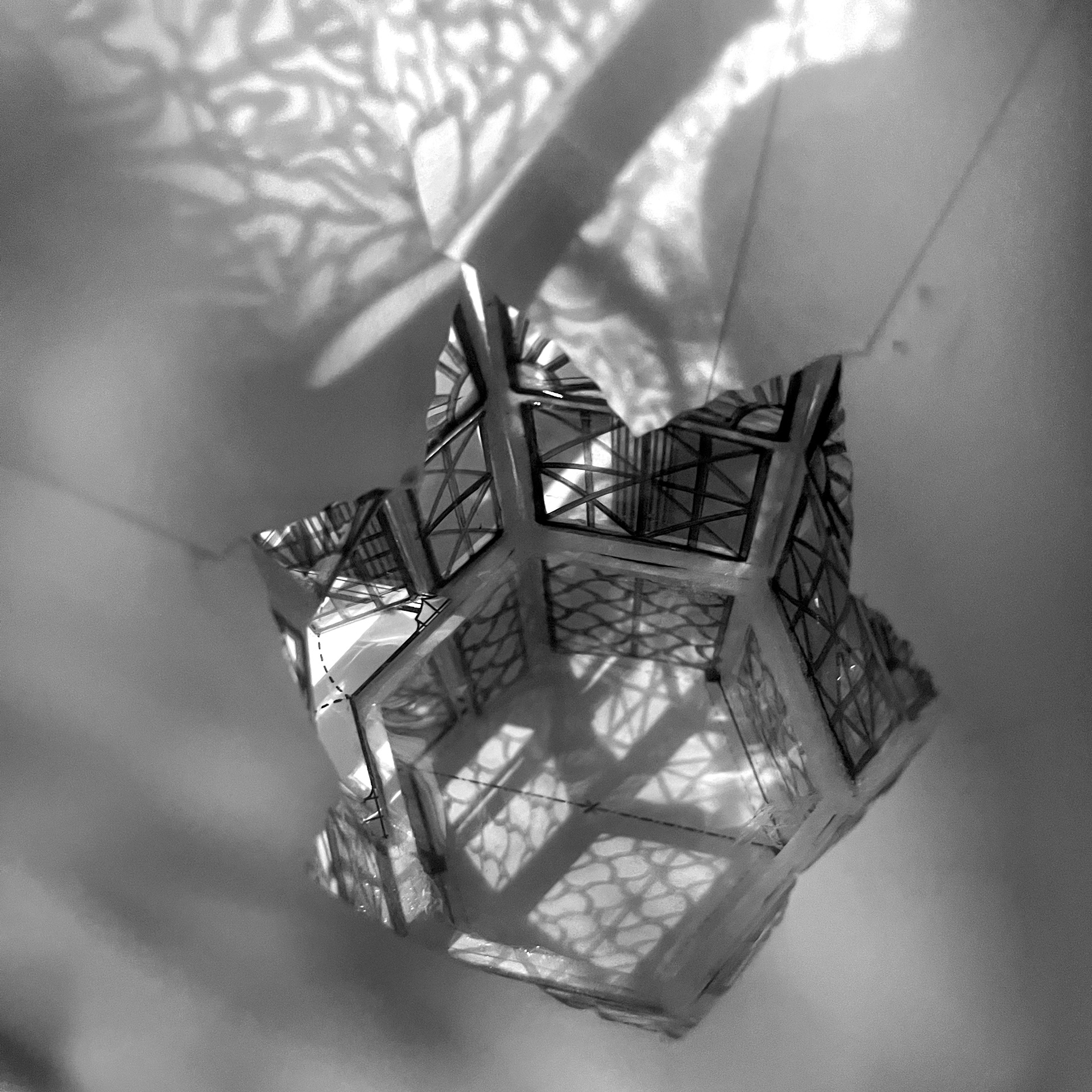
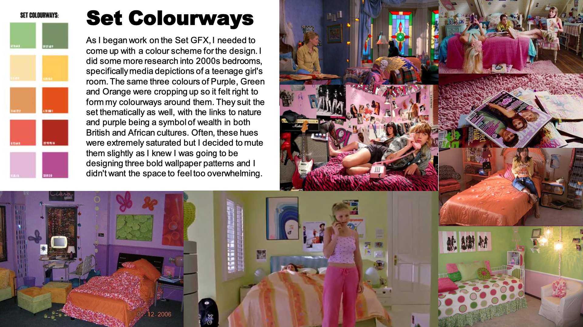
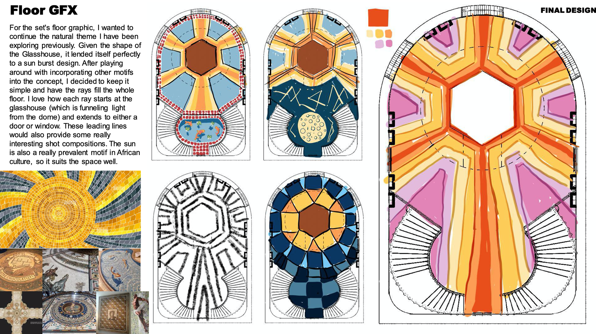
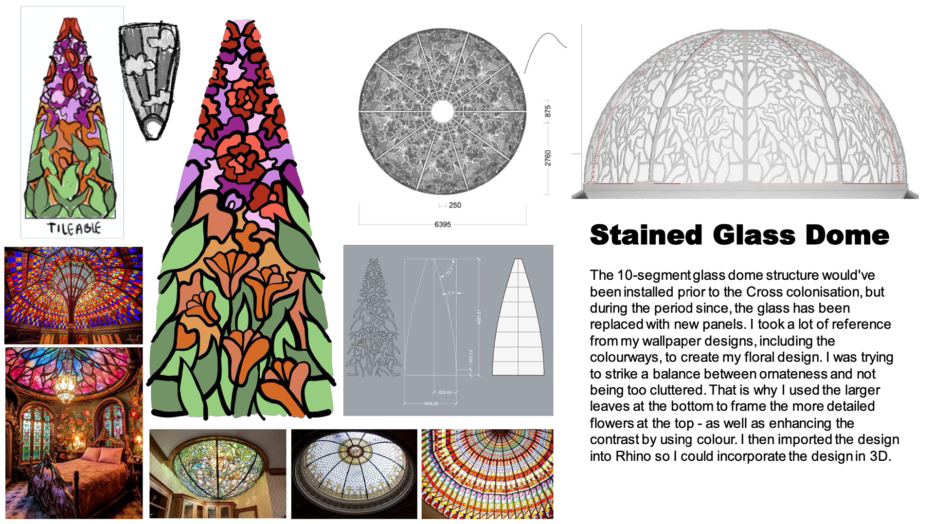
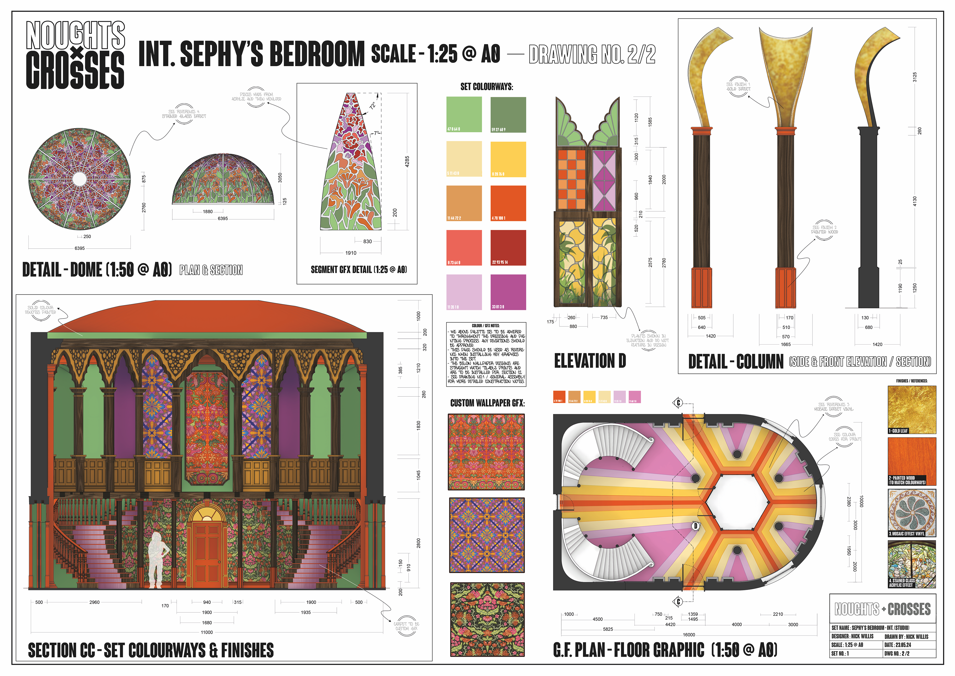
Alongside the wallpapers, I decided my set colourways and designed a printed floor graphic and stained glass panels for the glass dome at the top of the set.
GFX TECHNICAL DRAWING
I created a second page of drawings which focus more on the Scenic Graphics. I didn't have time to create concept art with the graphics I had designed, so I instead overplayed them onto a layout page to give a sense of the overall vision.
-------------------- MOTION POSTER --------------------
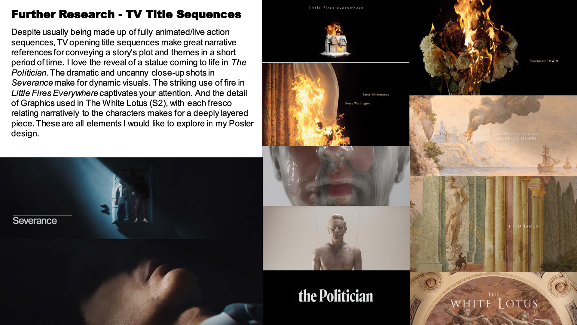
RESEARCH
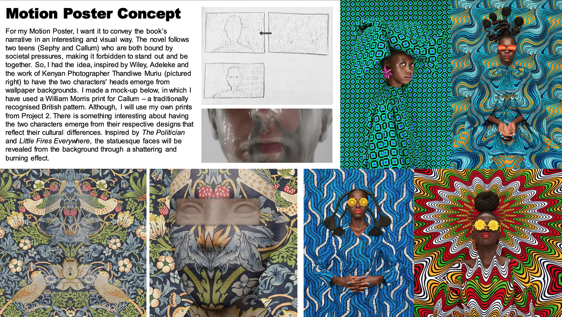
I began by researching Motion Posters, as well as TV Title Sequences to get a sense as to what was going to be achievable in the time I had. I loved the idea of the character being revealed from a patterned background, so I looked into some artists who created striking portrait paintings that featured bold patterns.


CONCEPT
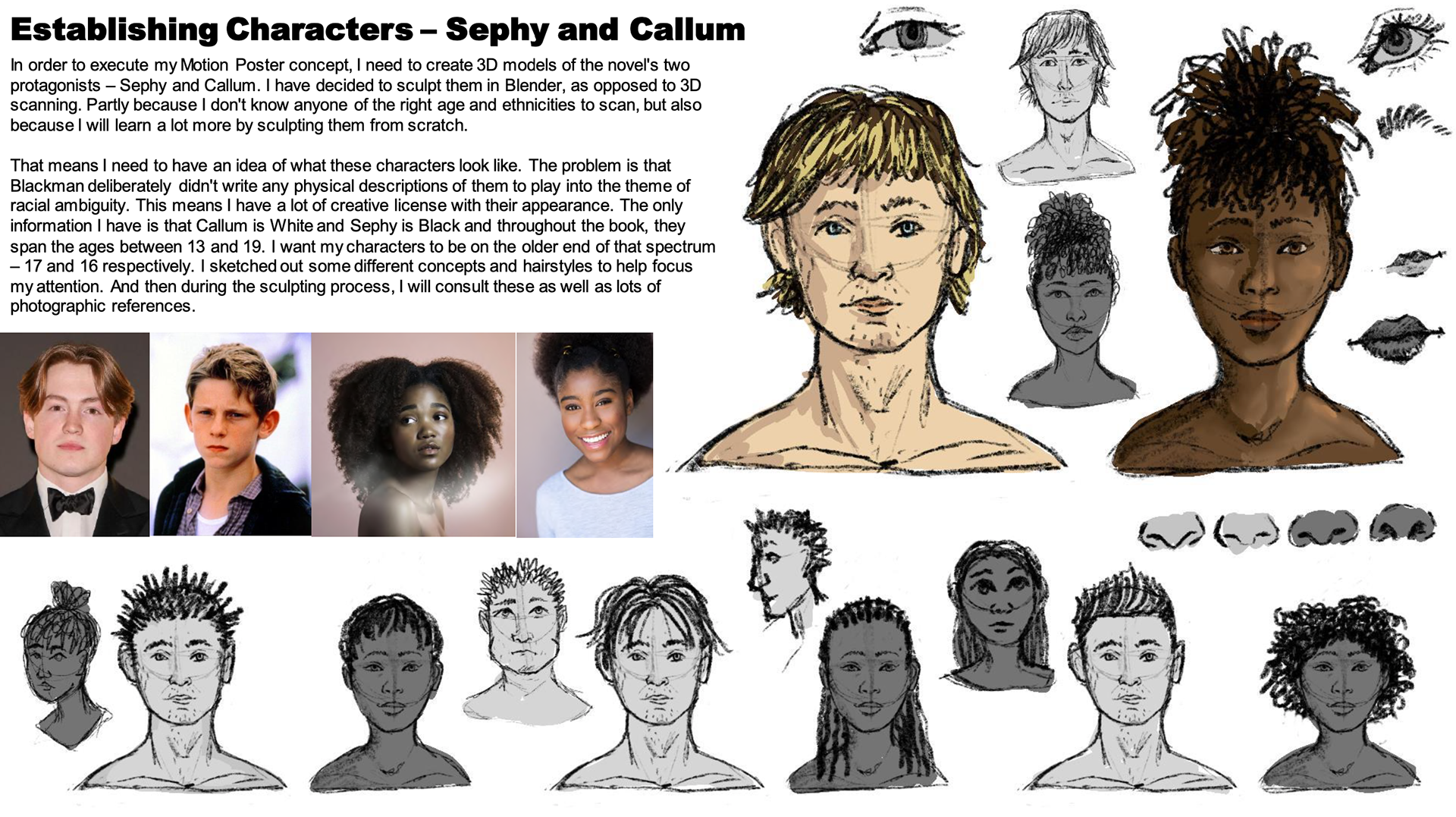
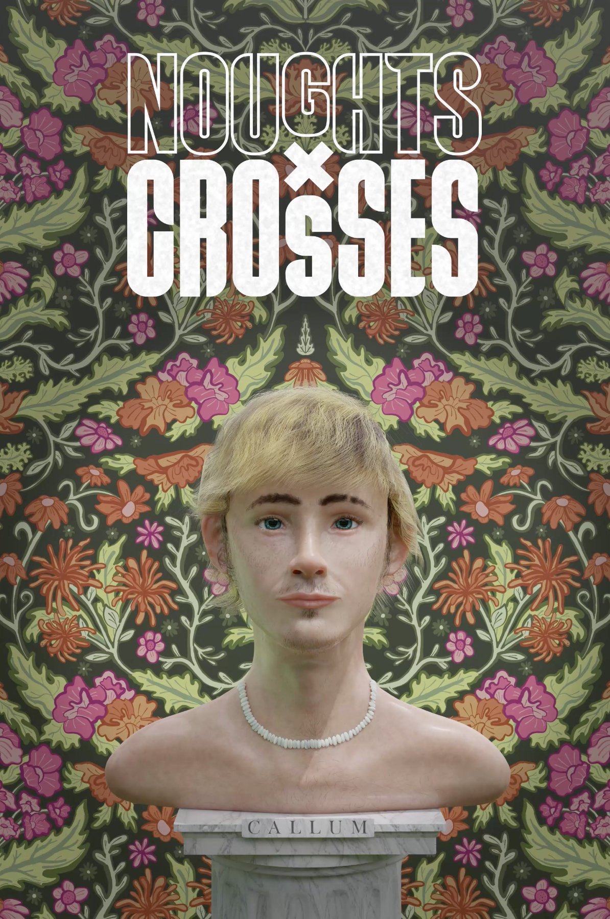
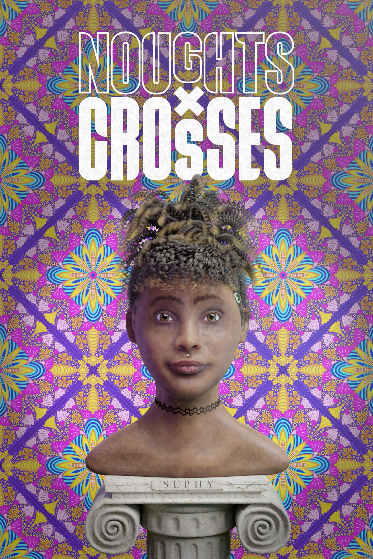
I decided I would digitally sculpt the novel's two protagonists Callum and Sephy. And have their faces emerge from my wallpaper graphics to symbolise how they defy the societal norms in the book to be together.
CREATION
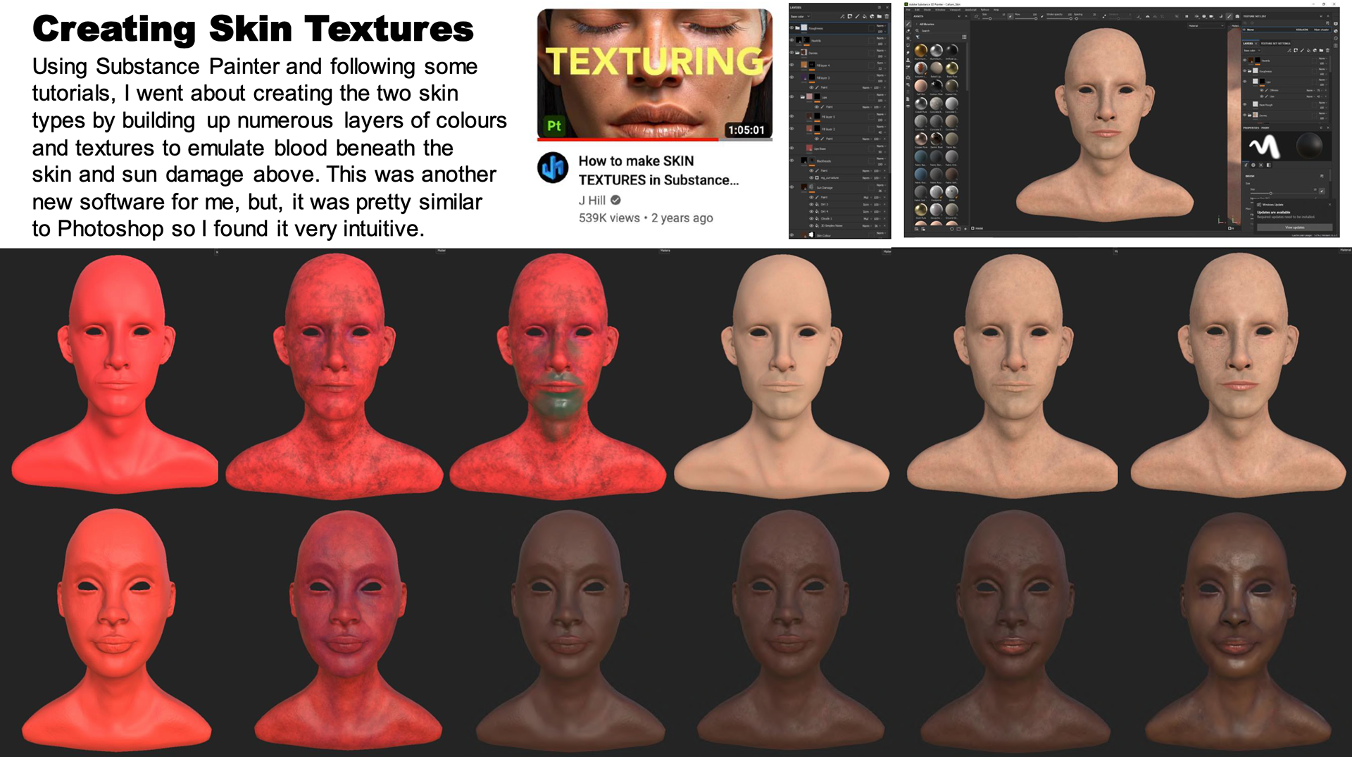
I used Blender 3D to model the two characters and Substance Painter to texture them. This was my first time digitally sculpting portraits and I was very pleased with how they turned out.


POSTERS
I designed a logo mark for the project before assembling a few variations of character posters for the project.

MOTION POSTER
I took these character posters and animated them in Adobe After Effects to create my final Motion Poster. I think it captures the essence of the story in a simple, yet effective way.